Planet Fitness came to us with a visual consistency problem. We created a more cohesive look, and during the process enhanced the entire user experience.
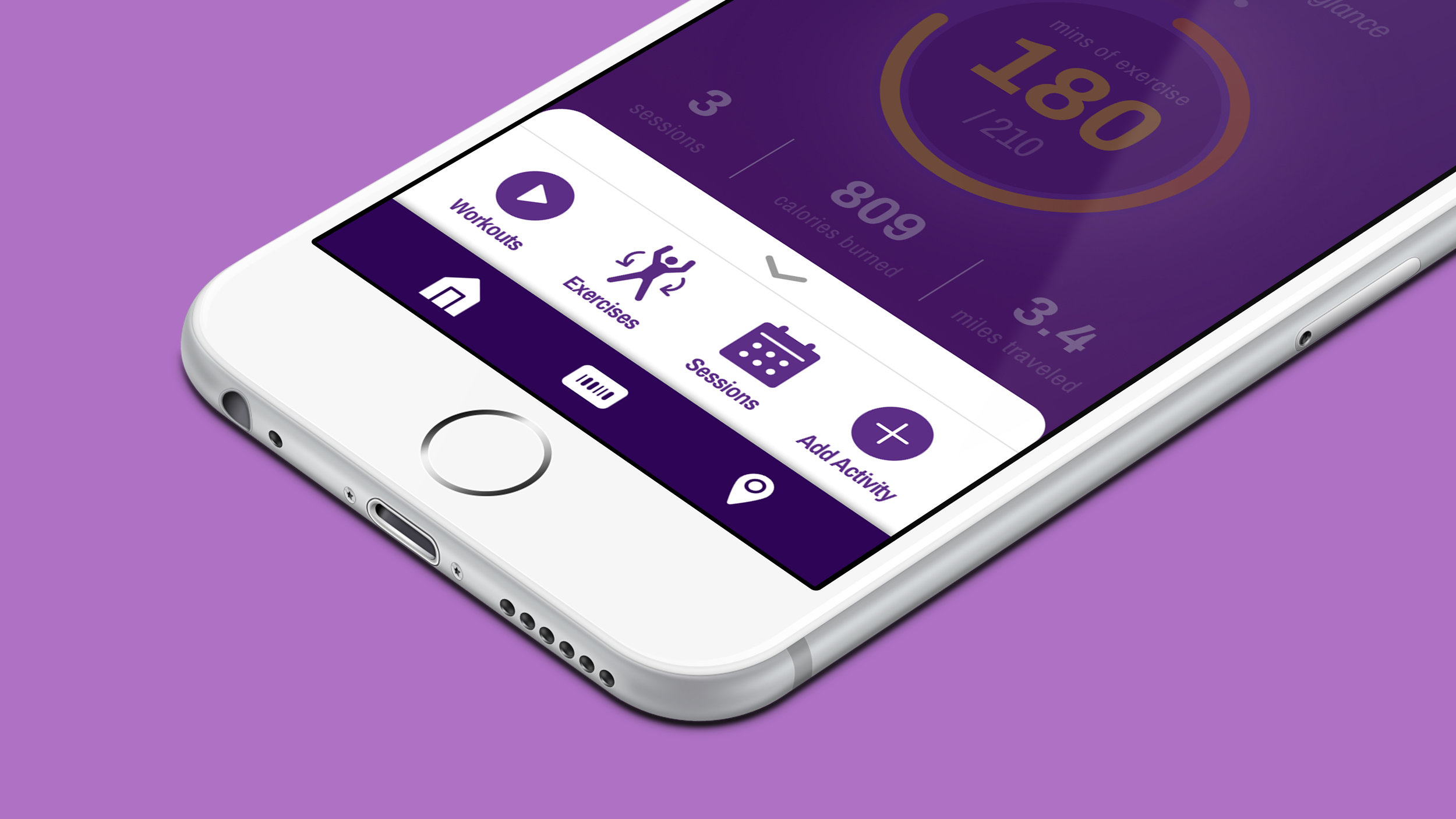
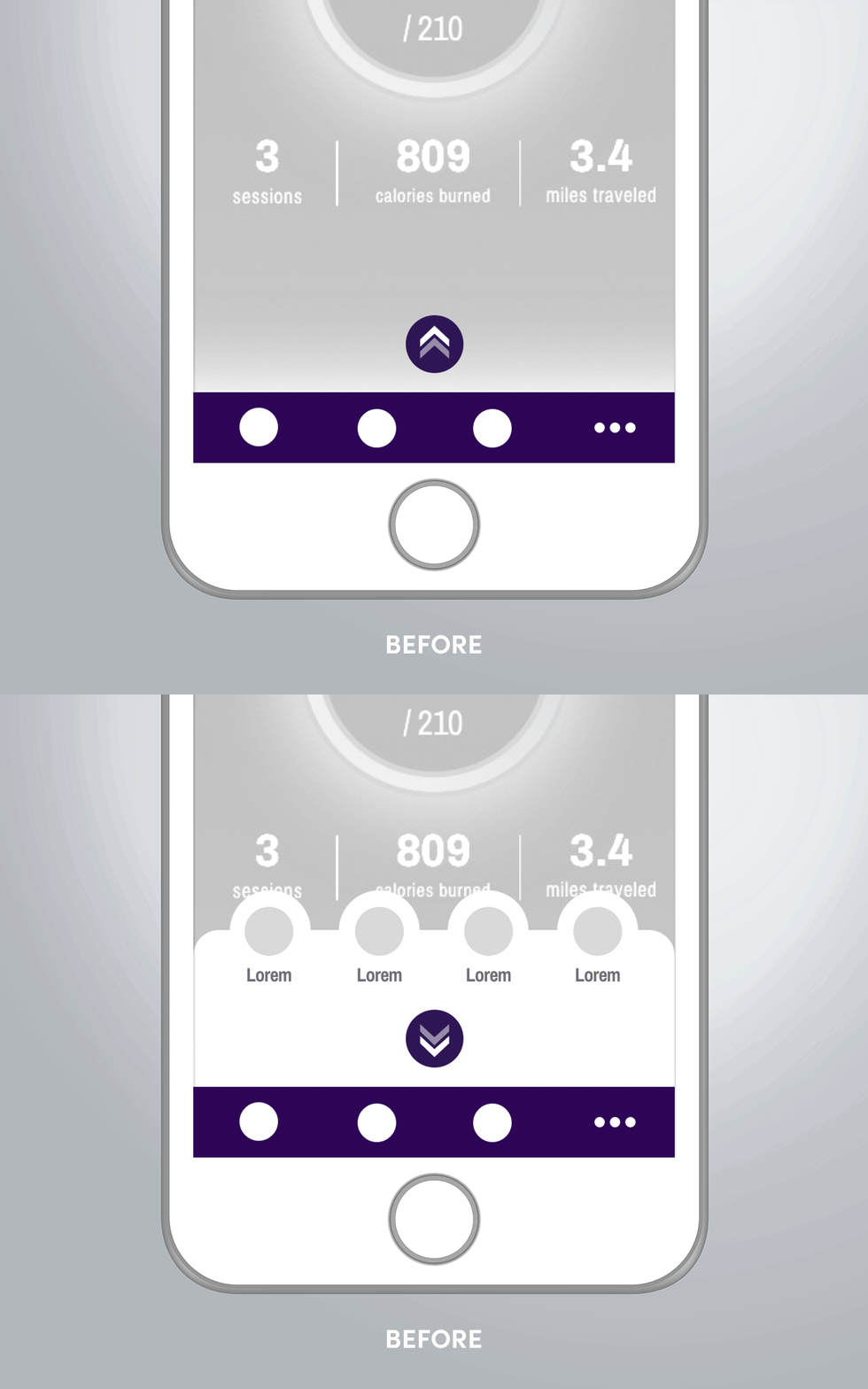
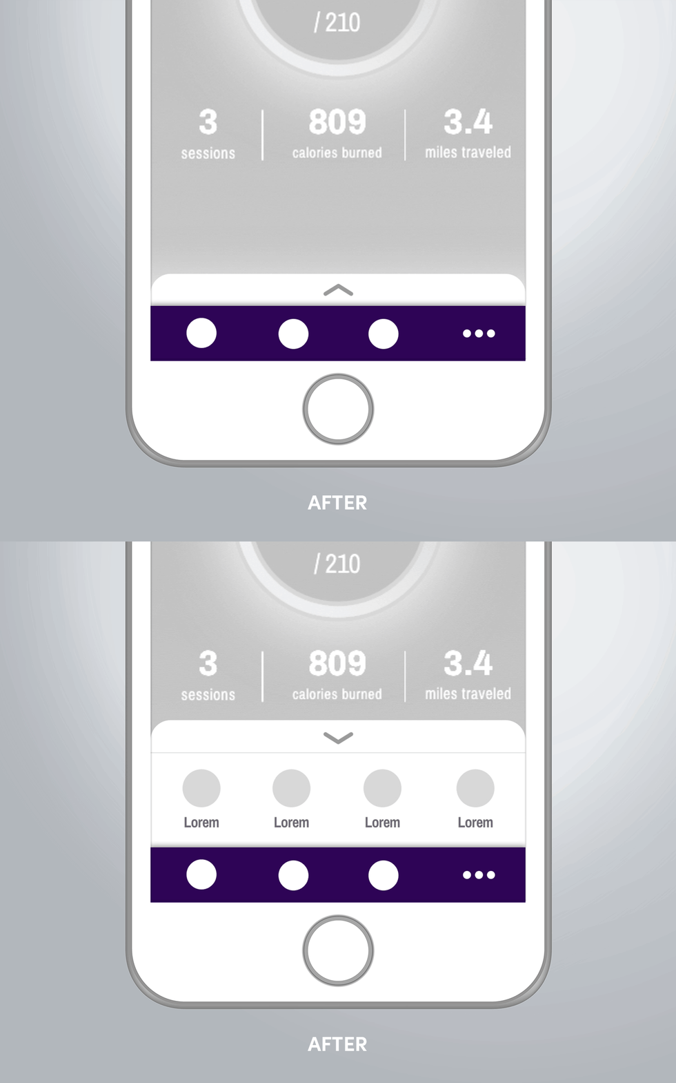
Planet Fitness approached our group to help them align the branding and imagery within their yet-to-be released app, but we noticed that there were issues in the experience that ran much deeper than the visuals. They began on the home page with many of the app’s primary features being hidden behind a novel access point. This not only was a barrier to using those features, but the uncommon pattern was harmful to discoverability. We encouraged bringing these features forward in the design and ultimately settled on a more common pattern for accessing it with a container that wouldn’t obscure other information on the page.
After the features were brought forward, we ran into more issues with the language and iconography used to identify them. To the uninitiated these buttons were hard to decipher and easy to confuse. We proposed new labels in addition to consistent and distinct iconography to improve intuitiveness and usability. Now “Workouts” indicates timed video routines, “Exercises” points to instructional content, “Sessions” clearly leads to a booking/calendar feature, and “Add Activity” more distinctly denotes a manual task as opposed to the automatic tracking that is inherent to the app. We also reworked the main navigation to fit into the newly defined icon style.
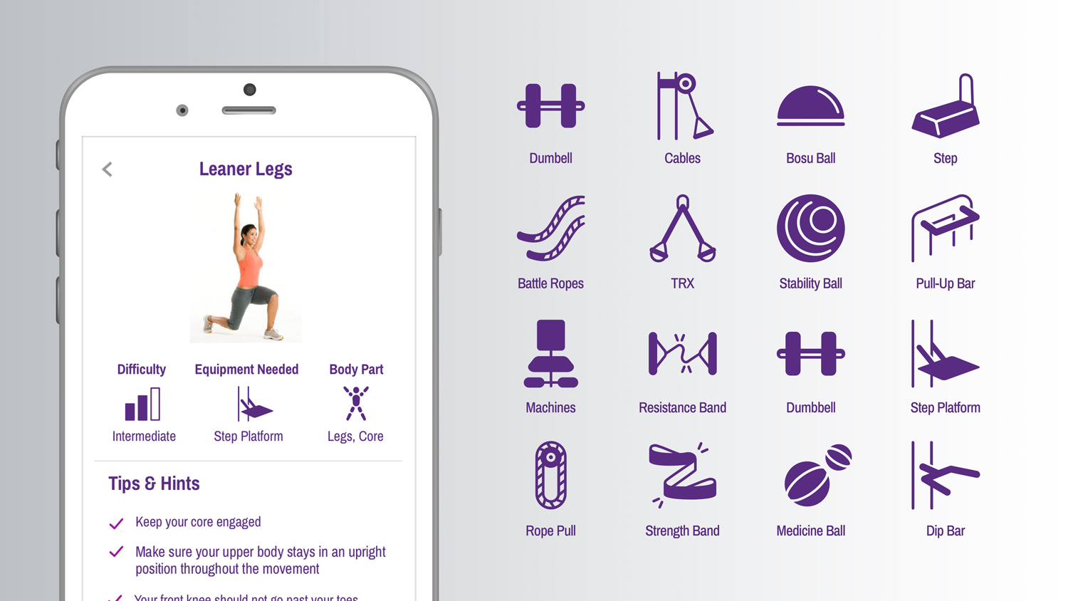
Finally, we came back to original request of consistency. To create a more cohesive look, we implemented a mini design system that allowed us to created over 100 unique icons that felt like they belonged together. Not only did the icons have to reference specific equipment, but they had to reference the form factors present in the Planet Fitness gyms, so we included just enough detail to direct users while maintaining readability at scale. The soft, rounded look is approachable and friendly to align with the Planet Fitness brand. While we weren't able to affect every touchpoint, I think these small adjustments make for a markedly improved user experience.
For the Equipment icons, we did what we could to match the look of actual Planet Fitness devices, while maintaining the approachable feel of our new navigation icons.
For the Activities icons, we did our best to avoid over-using person imagery to make each icon distinct at a quick glance. At the same time, a consolidated look keeps them on brand and part of the same family.
