
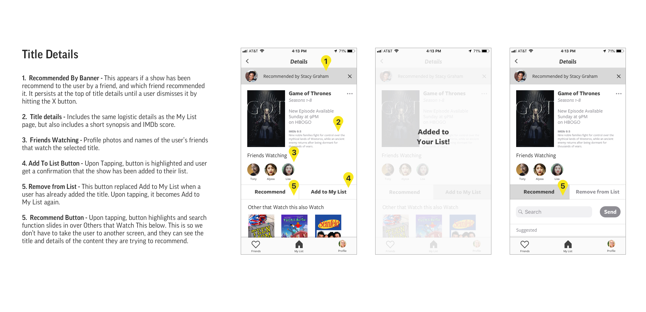
Good streaming content is hard to find and in-app suggestions usually miss the mark. How might we make content suggestions feel more personal or eliminate the search entirely?
A lot of people, including myself, watch an inordinate amount of streaming content. Whether it’s just on in the background, or a multi-season binge session, we can get through tons of shows and movies in a short amount of time. Despite the number of services and shows constantly being released, I found that myself and others often struggle to find content that we like. I hypothesized that this was a problem of organization within app interfaces and began interviewing avid streamers to validate it.
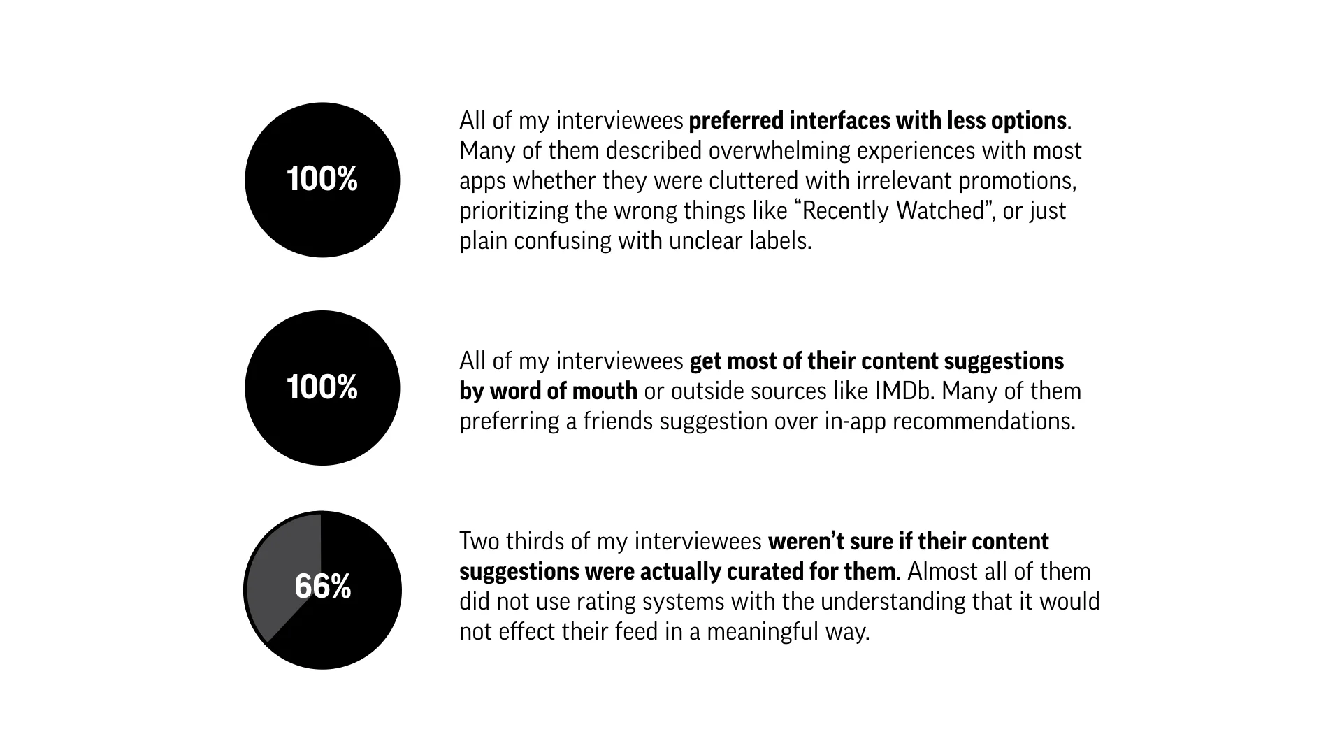
After several interviews I uncovered some common themes. To my surprise, the problem wasn’t just an organization issue, but a trust issue. Users are overwhelmed with bad suggestions or content that doesn’t suit them. They prefer recommendations from friends and family members, and without them they often give up and return to reliable favorites. I set out to solve both problems with an app.

I developed a persona around the streaming enthusiasts I talked to so I could define some of the behaviors, needs, and goals I wanted to address in this app. Then I created a storyboard of a typical trigger for this problem and how my solution would fit in. Generally, my user is an extensive TV streamer that uses every provider under the sun and spends most of their leisure time with streaming content.

Based on the needs and goals identified through my persona, I came up with a list of features that might help my user achieve them. Then I prioritized a subset of the most impactful and expected features to narrow in on an MVP. I knew the most impactful features would be a way to send and receive suggestions from a friend network, a social feed to see what others are watching, a chronological dashboard, and very clear labels of showtimes and locations with optional reminders. Then I put together a preliminary user flow to see where these features fit in.
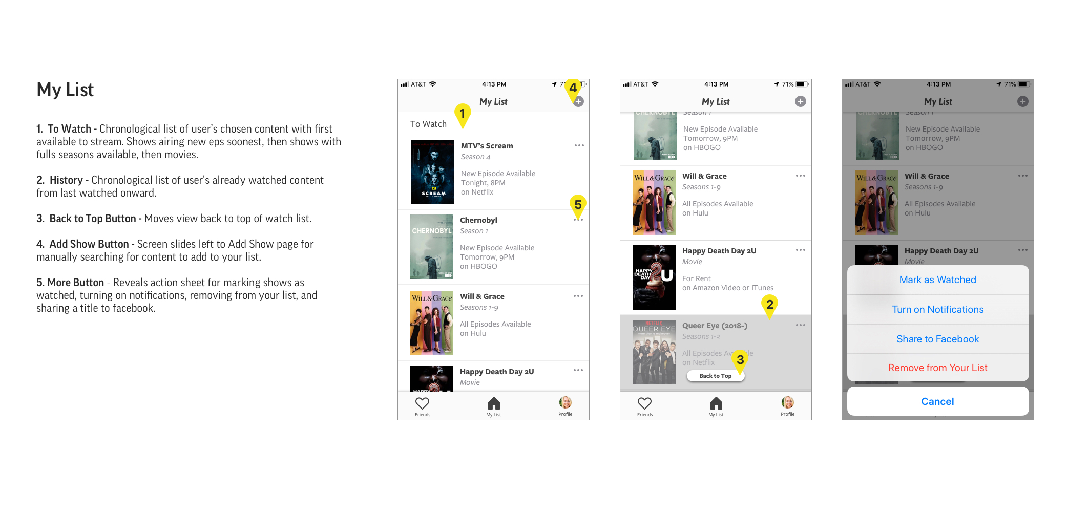
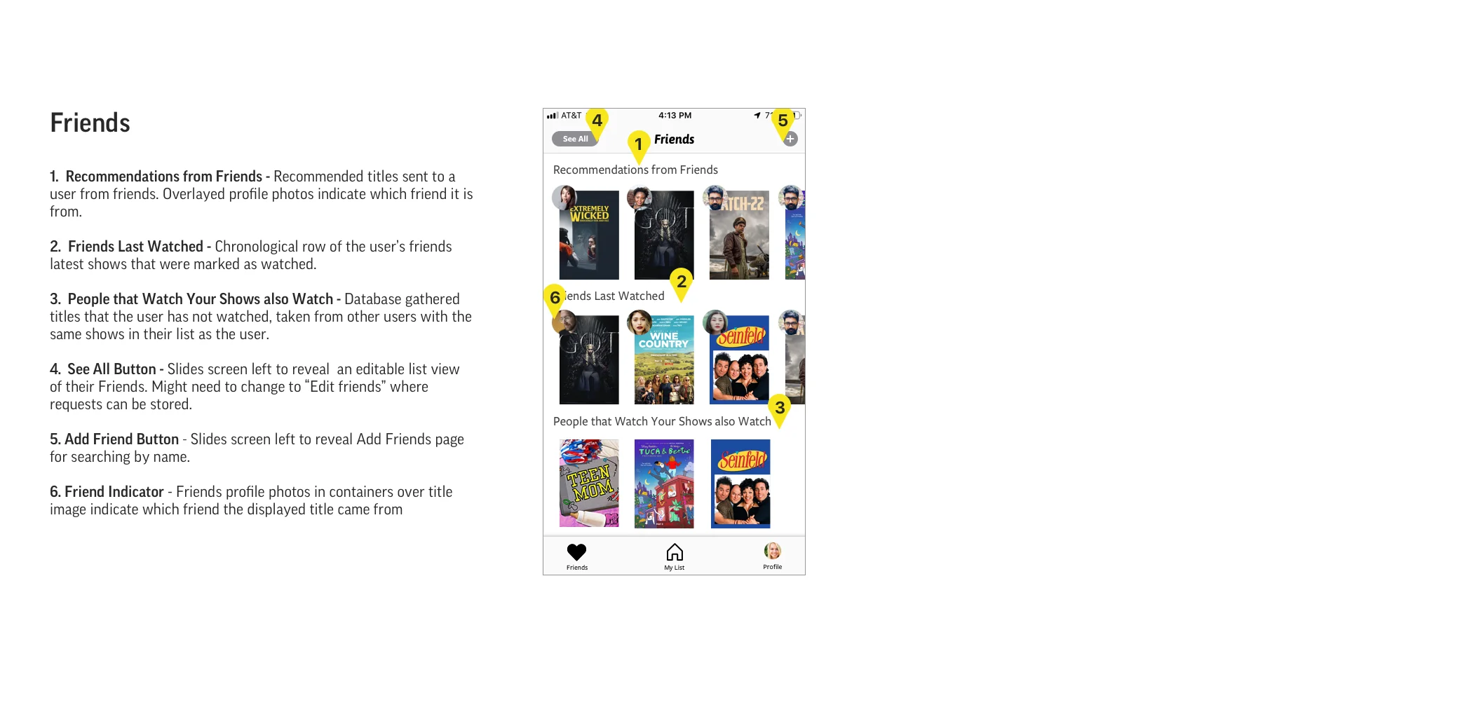
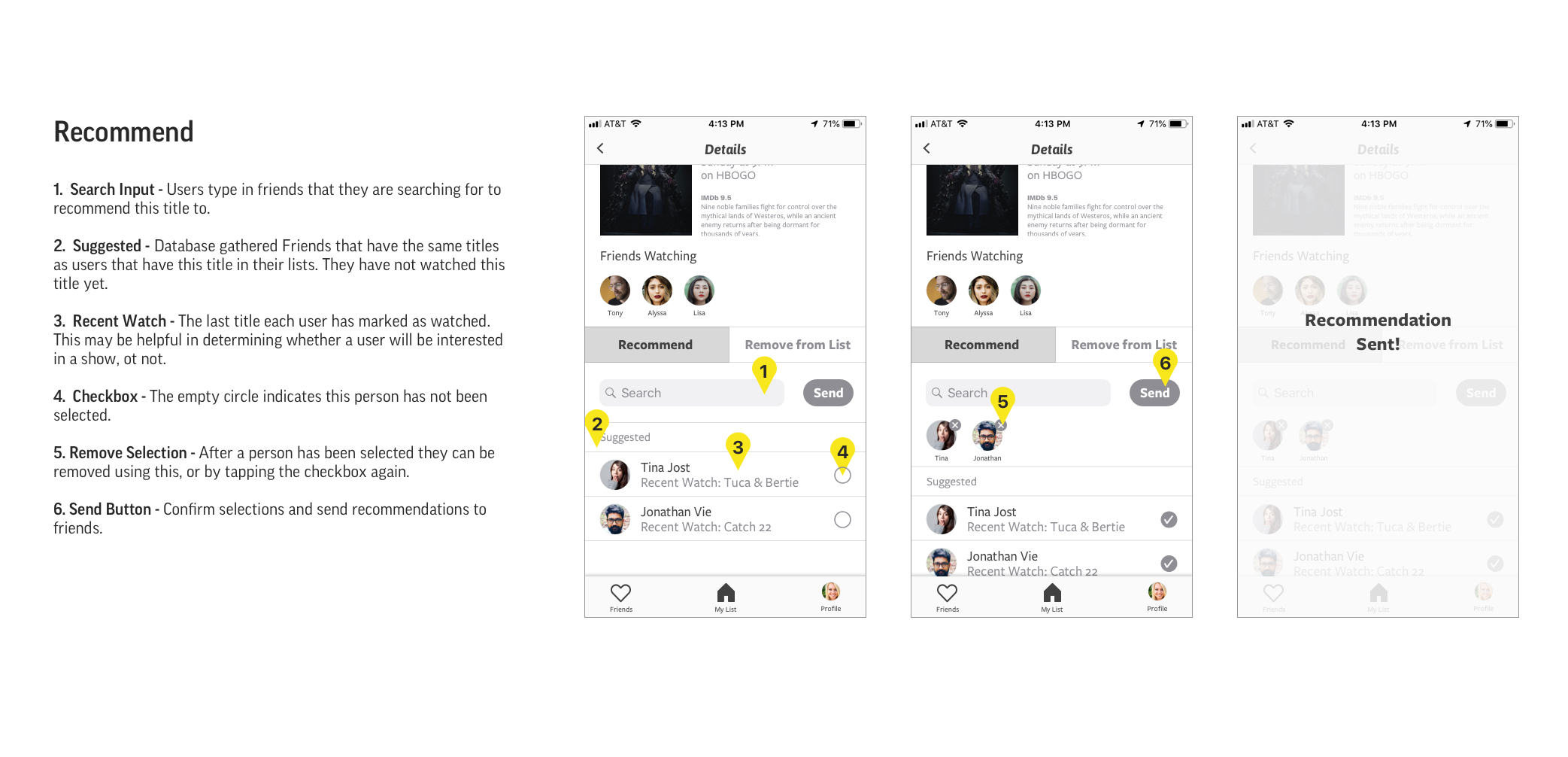
I went through many sets of wireframes before landing on something I thought might work, then created a paper prototype to quickly test it. Through testing I learned that some of my unlabeled buttons weren’t as intuitive as I they would be, but the most important lesson was that keeping track of shows was far less of a priority for my users. With a lot of potential overlap between what friends were watching and suggestions from friends, I decided to consolidate both into one, more robust Friends feed. Now suggestions were truly taking center stage and the queue was a place to store them for later.


I wanted to test these changes in a higher fidelity so I moved my paper prototype into Sketch, and used Invision to create a clickable prototype. The higher fidelity allowed me to play with scale and hierarchy to deliver just the right amount of information on each screen. I annotated this version with granular details to make sure no step was missed. Finally, I tested the high fidelity prototype against several user goals to determine if this app could solve the original problem.
Find a show recommendation from a friend. (hopefully as easy at sounds!)
Add a show to your list.
Recommend a show to a friend.
Find a show that's coming on tonight.
Set a reminder for a show.
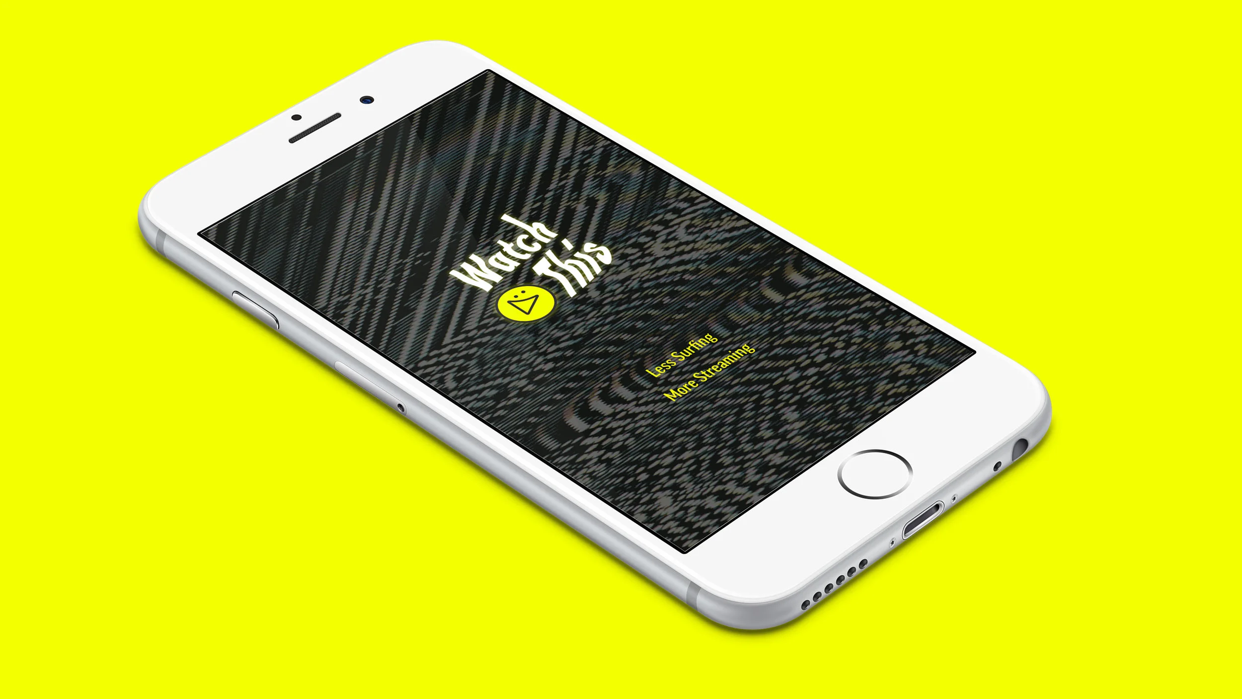
In short, all of my testers completed every task with ease except for areas where content was hidden behind a scroll. In the final iteration I brought those elements into view and created a quick brand to skin everything. In homage to the age before streaming, I incorporated TV static that one would inevitably run into while channel surfing. I implemented a “dark mode”-esque chrome that echoes a movie watching setting and used neon yellow for accents I wanted to pop. With a name like Watch This, it’s pretty clear what it’s made for. The entire app was designed over the course of a few weeks including research, interviews, ideation, wireframing, testing, and finalizing the design. Now we just have to build it!

